BLOG

Bootstrap: Accessibility and the Grid
We’ll look at adding in one of Bootstrap’s most useful features (at least to me). The grid system. Specifically the row and column flex-based layout. But before we can, we’re going to take a bit of a trip down memory lane and go on a rant about accessibility. Bare with me, there is a lot of history here to cover and some of it may be a bit hard to understand if you didn’t live with it.
Table-based Layouts
I have been making websites and web applications for nearly 30 years. In that time technology has changed much, as has what we expect that technology to do. Let’s use the Wayback Machine and look at some of the older sites.

Just looking at that makes me cringe. And Altavista was huge. However, that page shows heavily used <center> tags and not tables. So, let’s adjust the dials a bit and look at another example. This time from Lycos.

Again, remember how long ago were talking about here, let’s not pick on the design too much. In many ways, this was pushing what browsers back then could do. Let’s, instead, focus on the markup.
<table width="476" height="320">
<tbody>
  <tr valign="top">
    <td align="left">
      <form action="/web/19961025120628/http://www.lycos.com/cgi-bin/pursuit" method="GET">
      </form>
    </td>
  </tr>
  <!-- Search Form table-->
  <tr align="LEFT" valign="TOP">
    <td align="right" valign="MIDDLE">
      <b>Search:</b>
    </td>
    <td>
      <b>
        <select name="cat">
          <option selected="" value="lycos">The Web</option>
          <option value="sounds">Sounds</option>
          <option value="graphics">Pictures</option>
          <option value="a2z">Sites by Subject</option>
        </select>
        for:
        <input type="text" name="query" value="" size="20">
      </b>
    </td>
  </tr>
  <tr align="LEFT" valign="TOP">
    <td align="RIGHT" valign="MIDDLE">
      Search Options:
    </td>
    <td align="LEFT" valign="TOP">
      <select name="matchmode">
        <option value="and">match all terms (AND) </option>
        <option selected="" value="or">match any term (OR)</option>
        <option value="2">match 2 terms </option>
        <option value="3">match 3 terms </option>
        <option value="4">match 4 terms </option>
        <option value="5">match 5 terms </option>
        <option value="6">match 6 terms </option>
        <option value="7">match 7 terms </option>
      </select>
    </td>
  </tr>
  <tr align="LEFT" valign="TOP">
    <td align="RIGHT" valign="MIDDLE">      </td>
    <td align="LEFT" valign="TOP">
      <select name="minscore">
        <option value=".1">loose match</option>
        <option value=".3">fair match </option>
        <option value=".5">good match </option>
        <option value=".7">close match </option>
        <option value=".9">strong match </option>
      </select>
    </td>
  </tr>
  <tr align="LEFT" valign="TOP">
    <td align="RIGHT" valign="MIDDLE">Display Options:</td>
    <td align="LEFT" valign="TOP">
      <select name="maxhits">
        <option value="10">10 results per page </option>
        <option value="20">20 results per page </option>
        <option value="30">30 results per page </option>
        <option value="40">40 results per page </option>
      </select>
    </td>
  </tr>
  <tr align="LEFT" valign="TOP">
    <td align="RIGHT" valign="MIDDLE"></td>
    <td align="LEFT" valign="TOP">
      <select name="terse">
        <option value="terse">summary results </option>
        <option selected="" value="standard">standard results </option>
        <option value="verbose">detailed results </option>
      </select>
      </td>elect name="minscore">
        <option value=".1">loose match</option>
        <option value=".3">fair match </option>
        <option value=".5">good match </option>
        <option value=".7">close match </option>
        <option value=".9">strong match </option>
      </sele
  </tr>
  <tr align="LEFT" valign="TOP">
    <td align="LEFT" valign="TOP"></td>
    <td align="LEFT" valign="TOP">
      <input type="image" src="/web/19961025120628im_/http://www.lycos.com/graphics/gogetit.gif" border="0" align="top">
    </td>
  </tr>
  <tr align="LEFT" valign="TOP">
    <td width="25"></td>
    <td valign="TOP" colspan="2">
      <br><br>
      <a href="/web/19961025120628/http://www.lycos.com/search-help.html">Search language help</a>
    </td>
  </tr>
</tbody>
</table>
Before I go further, I want to point out that I did get this markup from the Wayback Machine and I did edit it to make it easier to read. I left some errors intact though they could be the result of the Wayback Machine. Also, browsers were white space was sensitive back then (though they were not supposed to be), so…
This type of layout was very common. Everyone from small-time web people experimenting with HTML on sites like GeoCities, and large massive companies would use this layout style.
Let’s not forget that the browser wars were in full swing. CSS was some magical thing that didn’t work, wasn’t widely used, and was more of an idea than a useful tool. What’s worse, is that the product owners (today’s term, but the people paying the bills) didn’t really care about browsers. To them, everyone used Internet Explorer because that’s what was in the office.
However, in the home Netscape Navigator was by far more popular. It’s hard to get real numbers from that far back but according to Statistics and Data Netscape had an 80% market share. And mobile, well, they had WAP in 1999 and not much else. If you wanted to browse something on your Palm Pilot, you would use a parser on your desktop and, let’s just say the results were not something that anyone seriously really worried about. Even Palm and Handspring knew they had to do something there, but couldn’t figure out what.
The problem with table-based layouts
There were several problems with this kind of layout, but there are three that we are going to focus on. First, is how hard it was to write. On the plus side, it was a dynamic that most of us were used to. It’s almost graph paper. This element goes from this square to this square. This element is two squares large. But, to get it to actually work, you usually had to have nested tables inside other nested tables. This was very hard to maintain and to get right.
Remember there is little or no CSS. So if you wanted something a specific width, you had to type it in every single time. Also you are in a table, and different browsers gave priority differently to sizes. So one cell in a row with a different width than a cell in the same row would give very unpredictable results.
If that wasn’t bad enough, the table design was not very future-proof. Now none of us have a crystal ball, but take a look at those example images. Those HUGE margins are because my screen size is large than what was available at the time. It got so bad that sites usually featured a section on their homepage saying something like:
Site best viewed in Netscape Nagivator 4.04 at 800x600
Usually with links to download the browser of choice. But today there is no standard resolution. And there’s no telling what browser a user may be using. This means that most of these sites have large design issues. You may say that sure 30 years later things are bound to be different.

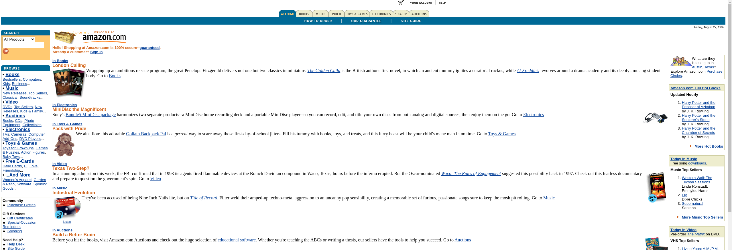
But it was doable. While this Amazon example is still pretty bad, it does work. (And yes it was using a table-based layout) However, Amazon was the outlier. It might be fairer to say that a well-done table-based layout was more future proof but Altavista and Lycos didn’t fail because of their tables. They were “good” designs at the time. But they would have also incurred a cost to update the “layout” every time there was a shift in browsers or popular screen sizes.
All of that doesn’t compare to the accessibility nightmare though. In the ’90s the general feel from most product owners was, with few exceptions, “who cares”. While I don’t know anyone that went out of the way to make sites less accessible, I can think of very few instances where product owners wanted to pay for the extra overhead of making a site accessible.
Then all of the sudden there was a great concern. Turns out you may be able to sue someone if their website isn’t accessible. There may be truth to that, but most of these law suites never make it to a final judgment. It’s a gray area at best, and the legal side is best left to lawyers. The important part is accessibility became important and table-based layouts were horrible for it.
Don’t use table-based layouts
OK, to be fair that statement is about 20 years too late and not the point of the post. But that dredge through history is almost over, and just out of habit it feels important to say. So if we developers have decided to move away from table-based layouts to something else, then what is the something else.
divs are the obvious answer, but we need them to do some of the stuff tables were doing. That’s where Bootstrap’s grid system comes in. Yes, we just skipped 20 years or so of history and development, but I think we have walked down memory lane enough. Let’s jump ahead to the answer, and how to implement it in our gem.
Implementing the grid system in Boostrap
At its core the markup is pretty simple
<div class="container">
  <div class="row">
    <div class="col">
      Column
    </div>
    <div class="col">
      Column
    </div>
    <div class="col">
      Column
    </div>
  </div>
</div>
That’s right from their example. In practice, it gets a bit more complicated. Often we need to implement breakpoints and set sizes more manually to get the desired results. More normal markup may look like
<div class="row">
  <div class="col-12 col-md-6 col-lg-4 border">
    Column
  </div>
  <div class="col-12 col-md-6 col-lg-4 border">
    Column
  </div>
  <div class="col-12 col-md-6 col-lg-4 offset-md-3 offset-lg-0 border">
    Column
  </div>
</div>


Remember that in the old days that would have been three different layouts. Today, with bootstrap, we get one set of markup and a result that looks good without depending on screen size.
More importantly, the row and grid systems are accessible. When parsed by accessibility tools like screen readers and text-to-speech engines, the same message is conveyed. So we get markup that is easy to maintain, the product owners don’t need to worry about massive extra costs every time a new screen size becomes popular, and it’s accessible to boot. Bootstrap’s Grid System is a great tool. Let’s add in some helpers to make it a bit easier to use.
The way I like to write it is:
<%= row do %>
  <%= col size: 12, md: {size: 6}, lg: { size: 4 } do %>
    Column
  <% end %>
  <%= col size: 12, md: {size: 6}, lg: { size: 4 } do %>
    Column
  <% end %>
  <%= col size: 12, md: {size: 6, offset: 3}, lg: { size: 4, offset: 0} do %>
    Column
  <% end %>
<% end %>
That may not seem like a huge difference, and in our small sample it isn’t but in the real world that is huge. Especially when in the real world we may have large nested groups of these.
The Class and Bootstrap Helper
# lib/bootstrap_helpers/helpers/grid_helper.rb
def row(options = {}, &block)
  raise ArgumentError, 'Missing block' unless block_given?

  klass = options[:class] || ''
  klass += ' row'
  grid = BootstrapHelpers::Grid.new(self)
  content = capture(grid, &block)
  bs_render template: 'grid/row', content: content, locals: { classes: klass }
end

def col(options = {}, &block)
  # col is not always used inside a row

  grid = BootstrapHelpers::Grid.new(self)
  classes = BootstrapHelpers::Grid.generate_col_classes(options)
  id = options[:id] || SecureRandom.uuid
  content = capture(grid, &block)
  bs_render template: 'grid/column', content: content, locals: { classes: classes, id: id, style: options[:style], content: content }
end
The helper is pretty simple. Nothing you haven’t seen in our previous posts on bootstrap helpers. I do want to take a second and point out that the col and row helpers are both entry points. There are plenty of times you may want to use a column outside a row.
def self.generate_col_classes(options)
  classes = []
  classes << options[:class] if options[:class]
  classes << "col-#{options[:size].to_i}" if options[:size]
  classes << "offset-#{options[:offset].to_i}" if options[:offset]
  %i[sm md lg xl].each do |size|
    classes << get_classes(options, size)
  end
  classes.flatten
end

def self.get_classes(options, key)
  classes = []
  if options[key]
    classes << "col-#{key}-#{options[key][:size]}" if options[key][:size]
    classes << "offset-#{key}-#{options[key][:offset]}" if options[key][:offset]
  end
  classes
end
I’m also not going to go over all of the Grid class either. But I want to showcase these two methods. Together they build the default col-12 style of class declarations and the col-lg-12 size style. Along with the offsets. It’s also important to notice that you can do:
<%= row do |r| %>
  <%= r.col do %>
    content
  <% end %>
<% end %>
Or you could not pass the Grid class into the block:
<%= row do %>
  <%= col do %>
    content
  <% end %>
<% end %>
Both are valid, and, in my opinion, important to support.
Extending Later
The only thing that I would like to do is to extend this with a bit of configuration that allows you to state the breakpoints. With bootstrap you can define the breakpoints you desire, including new/custom ones. It would be nice to be able to pass that in via config instead of having to override the entire Grid class. And, of course, there is a bit of code clean-up to do.
YOU MAY ALSO LIKE

August 19, 2022 - Robert C.
Creating Bootstrap Alert Helpers in Ruby on Rails

August 12, 2022 - Robert C.
Adding the First Helpers in Ruby on Rails


