BLOG

How to Build an iOS App for Dark Mode
Apple added support for dark mode with the iOS 13 release. Even though dark mode has been available for a while, it is still a common problem for applications to either not support dark mode or to have some display issues when a user switches to dark mode. Below we cover the ways that a developer will need to adapt their app to support dark mode.
Setting up Colors for Dark Mode
Apple has added new color types that will automatically support both light and dark mode. Most iOS developers should be familiar with predefined colors, such as red and blue, that can be accessed from UIColor. Now there are also system colors that have different values that are suitable for both light and dark mode. A couple of examples are .systemRed and .systemBlue. These system colors are slightly different and are meant to be suitable shades on both light and dark backgrounds.
Semantic colors are the other newer addition that can be used to support both light and dark mode. Instead of a color value, a semantic color is defined by its purpose. A few examples of semantic colors are .label, .secondaryLabel, and .systemBackground.
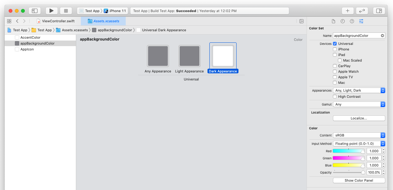
Although the new color additions are easy to use, most applications are going to require specific colors based on branding guidelines. So to have more control over the exact color values, developers can create custom colors that have both light and dark values. The most common way to do this is to create your custom colors in the asset catalog. When you add a new color set in the asset catalog the key is to update the appearances option to include dark. You can choose Any, Dark or Any, Light, Dark. The Any Appearance option is used for older phones that don’t support dark mode while the Light and Dark option corresponds directly to light and dark mode. To use the custom color, you can load it by name in code.
let backgroundColor = UIColor(named: “customBackgroundColor”)

Adding Support for Icons and Images for Dark Mode
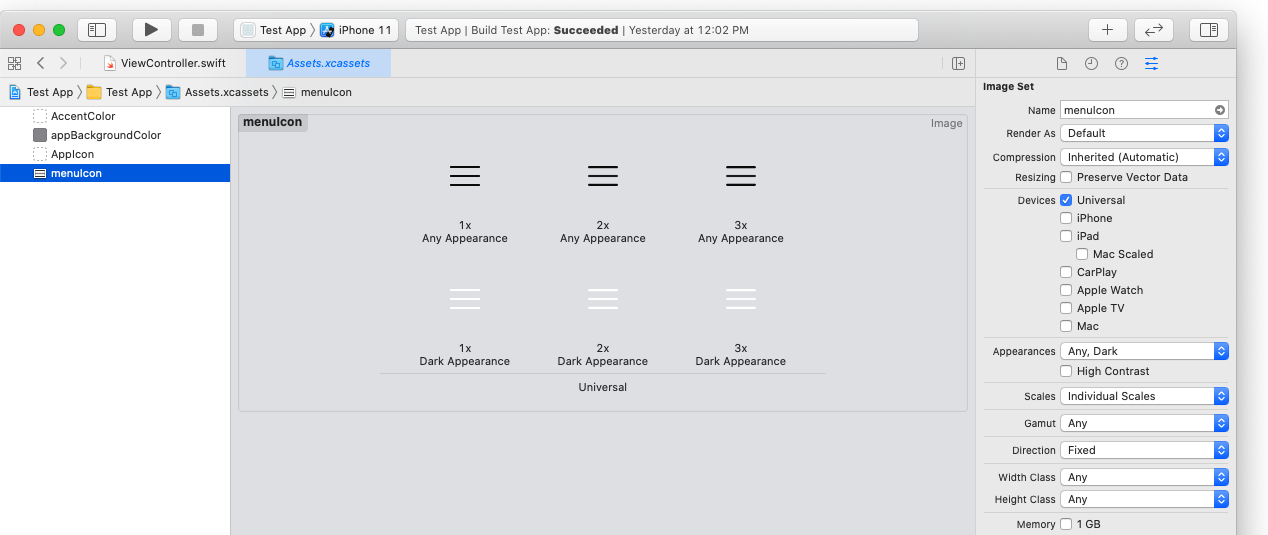
After we add support for colors we will need to add support for icons and images. For this, we can again use the asset catalog to add support for light and dark appearance. We will update the Appearances option to either be Any, Dark or Any, Light, Dark just like we did with the color set. This will allow the app to use a different image to display while in dark mode.

Apple has also added a library of highly configurable images called SFSymbols. These symbols are created to scale well and they are made to support dark mode. You can set the tint color to any custom or dynamic color that your app is using and the image will adapt. This library gives developers a large set of options that can be used without requiring custom graphic design. You can download the app to start using SFSymbols here https://developer.apple.com/sf-symbols/.
The Unrecommended Option to Opt Out
For developers who don’t want to support dark mode, Apple does give you a way to opt out. We don’t recommend this solution since iPhone users now expect apps to support dark mode, but the option is available. The easiest way to opt out of supporting dark mode is to set the UIUserInterfaceStyle key to Light in your app’s Info.plist. This will override the dark mode setting and always display your app as if it were in Light display mode.
Again, we don’t recommend doing this as iPhone users are beginning to expect apps to support dark mode. If you need your apps to function in the interim while you properly implement dark mode though, this is an option to get you by.
YOU MAY ALSO LIKE
May 22nd, 2020 - Brian T.
Building iOS Apps with SwiftUI

Aug 28th, 2020 - By Brian T.
Native vs. Hybrid Apps: The on-going discussion


